WWDC20 review
A quick review of the keynote and State of the Union talks. Let’s see which of my wishes have been fulfilled, and which SwiftUI problems have been solved.

SwiftUI
They didn’t call it SwiftUI 2.0 (in fact it didn’t get a version number at all), but quite a lot has been added and improved. Grids are completely new, as is its LazyGrid counterpart. There are also new LazyVStack and LazyHStack views. I think this could solve a lot of performance problems, nice.
Much more interesting to me is StateObject: a new property wrapper that does the same as ObservedObject, except SwiftUI won’t recreate it when the view is recreated. It’s now finally easy to work with view models, no longer do you need to pass them in from a parent/container view. Paul Hudson has explained it very well.
You can now also create the entire app using pure SwiftUI, no more AppDelegate or SceneDelegate needed. And there’s a new project template in Xcode for creating truly universal apps that run on iOS, iPadOS and macOS.
More UIKit views have been brought over to SwiftUI, like Maps, the Sign In with Apple button, progress bars and activity indicators. A good step in the right direction.
Problems that don’t seem fixed: custom navigation title views, custom list actions, improved keyboard handling, NSAttributedString support, and navigation is still as bad as before. Really my biggest problems are still unsolved.
Overall, to be honest, I am disappointed and would’ve loved to see more changes, even if they were backwards incompatible.
Combine
Nothing new. No new APIs, no talks, nothing. I’m quite disappointed. I only gave it a 50% chance, saying “I think this will come at some point, but maybe not this year”, but I would’ve loved to be wrong.
iOS / iPadOS

We can change the default browser and mail app! It’s been a long time coming, but it’s good it’s finally here. That said though, I actually like Safari and Mail and have no interests in changing these. I’d love to be able to change the default camera, which is still not possible.
I really wish they would’ve reverted the excruciating cursor control, but sadly that’s here to stay - at least for another year. iPad multitasking hasn’t changed one bit either, still as bad as ever. There is a new design language using sidebars which is nice, but it’s not too exciting.
Of course there is no Xcode on iPad, but I really didn’t expect that either.
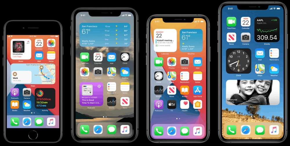
Some great improvements: widgets! A smaller non-blocking Siri UI and incoming-call UI! The new app library is pretty nice too, although I don’t think I would use it too often. Picture-in-picture on the iPhone is nice, but also something I don’t see myself using too often.
App Clips are a much bigger new feature, and something I am quite interested in. I think it’s a really good addition to iOS.
I really like the addition of privacy “nutrition labels” on the App Store, giving an overview of exactly what personal data is stored and tracked by each app. Apple’s stance of user privacy is definitely a huge reason why I am still an Apple fan, even with all the negative things going on.
And oh my god, finally there is a search field on the Emoji keyboard! A lot of good changes, a really good WWDC for iOS and iPadOS.
Apple Watch
Sleep tracking has been added, which was on my wishlist. They also added something called “face sharing” which sounds more interesting than it is: there are still no custom watch faces (which I gave a 25%), you can only share a specific configuration of an existing watch face and combination of complications. Snore.
Other features they added were a dance workout and hand washing detection, which then starts a 20 second timer. I don’t really care about either of these things. Overall for the Watch it was a disappointing year.
macOS

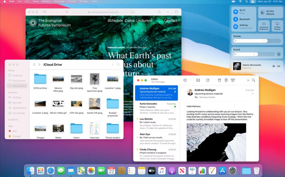
Not a single mention of TestFlight for macOS, which is really unfortunate. On a positive note, I do really like the new design language, with the rounded corners, more color has been added all over the place, menus got more room to breathe. It feels fresh but very familiar.
Of course the new Apple Silicon chips are very interesting. I am expecting big performance and battery life wins. I think macOS now finally being on version 11 makes a lot of sense (not in love with the Big Sur name though).
Catalyst has been greatly improved, with the apps looking a lot more like proper macOS apps, just like I predicted. It’s good that a lot more of Apple’s apps are now built with Catalyst - they’re eating their own dogfood.
I think the future is very bright for macOS and Mac hardware.
